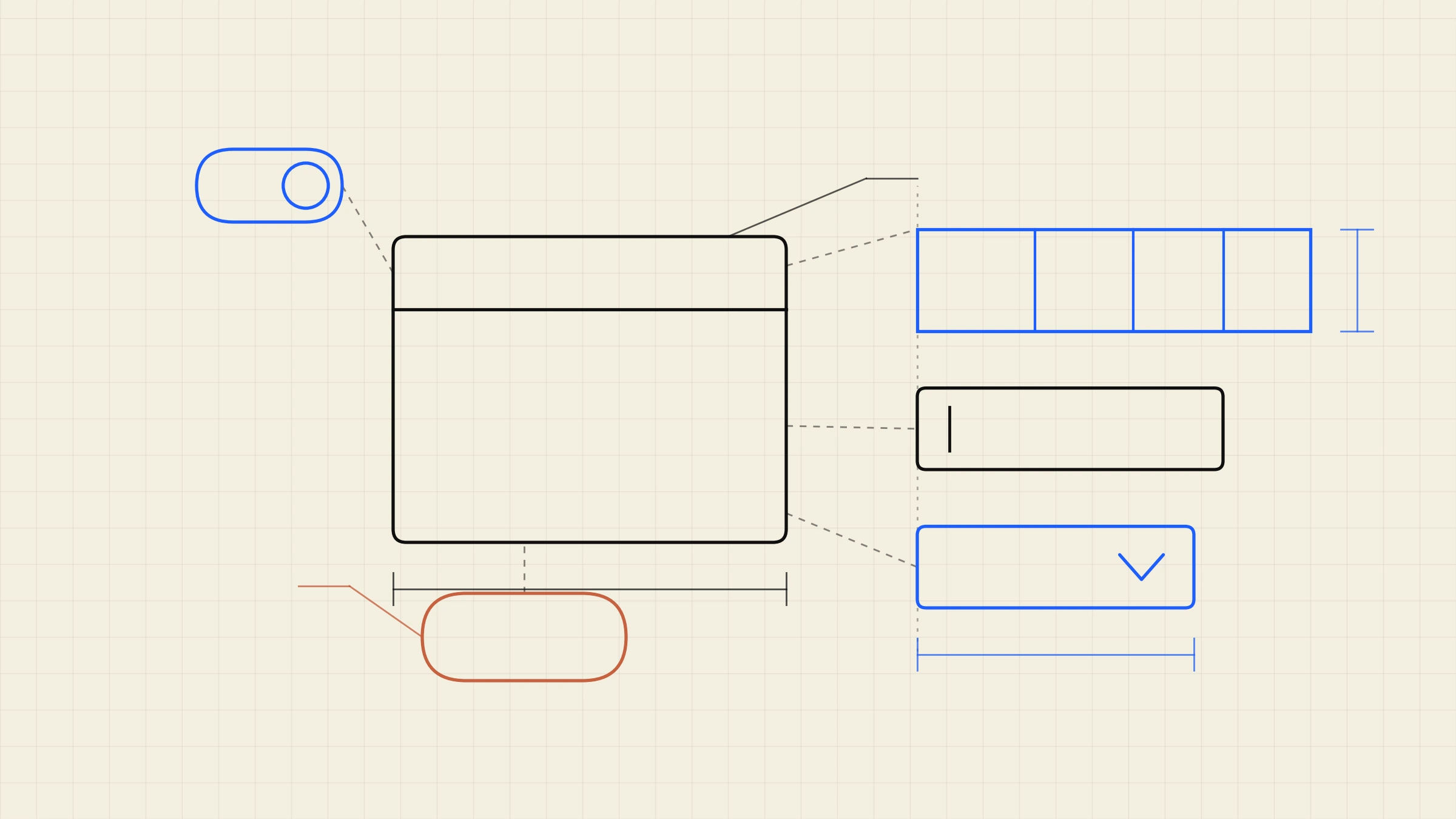
A founder forwarded us a $38,000 design system quote in August and asked one question: what is a component, and why do I need 80 of them?
Reasonable question. Nobody answers it on a sales page, because the honest answer makes the quote sound smaller than it is in some places and much larger in others. We build these, so the pricing below is informed rather than neutral. The figures under it are published and checkable.
The 2026 price list
Published 2026 pricing guides put the market in three fairly clean tiers.
Starter, $5,000 to $10,000. A core library of roughly 30 to 50 components, basic design token architecture, and a Figma library set up properly. Buttons, inputs, selects, modals, tables, cards, navigation. Enough to stop your product drifting.
Growth, $10,000 to $25,000. A full library of 60 to 100 components, complete token architecture, interaction documentation, an accessibility review, and real developer handoff. This is the tier most funded B2B products actually need.
Enterprise, $25,000 to $60,000 and up. Multi-brand support, 100 or more components, full code integration, Storybook documentation, a governance framework and team training. Published timelines for this tier run 12 to 20 weeks.
For reference, the broader market numbers behind those tiers: agencies quote $10,000 to $50,000 for a design system built from scratch, freelancers $5,000 to $20,000 for comparable scope. Hourly rates in 2026 run $100 to $149 at mid-market specialists, $150 to $200 at senior boutiques, and $200 to $300 at highly specialised firms.
So the founder with the $38,000 quote was being quoted a Growth-plus system at senior boutique rates. Not a rip-off. Also not obviously necessary, which is the part the quote could not tell him.
Why 2026 costs more than 2023 did
Here is the thing that actually changed, and it is not inflation.
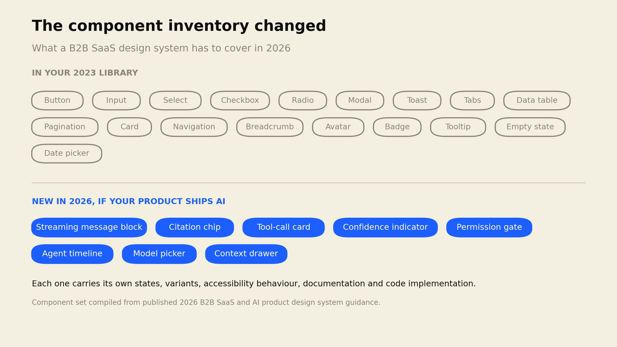
B2B products now ship AI features, and AI features need interface components that did not exist when most design systems were scoped. Streaming message blocks. Citation chips. Tool-call cards. Confidence indicators. Permission gates for agent actions. Agent timelines. Model pickers. Context drawers.
None of those are in your 2023 component library, because in 2023 they were not a product pattern anyone had settled. Each one carries the same weight as any other component: states, variants, accessibility behaviour, dark mode, mobile, documentation, and a code implementation that matches the design. A confidence indicator sounds like a small badge. It is a small badge with six states, an explanation affordance, and an accessibility problem nobody has solved cleanly yet.
If your product has an AI surface and your quote does not itemise these, one of two things is true. Either they are not in scope and you will pay for them in a second phase, or they are in scope and the person quoting has thought about this more carefully than most. Ask which. That question tells you more about a vendor than their portfolio does, and it is the honest answer to why the quote went up.
What the system gives back
Most design system ROI claims are marketing. There is one exception worth knowing by name.
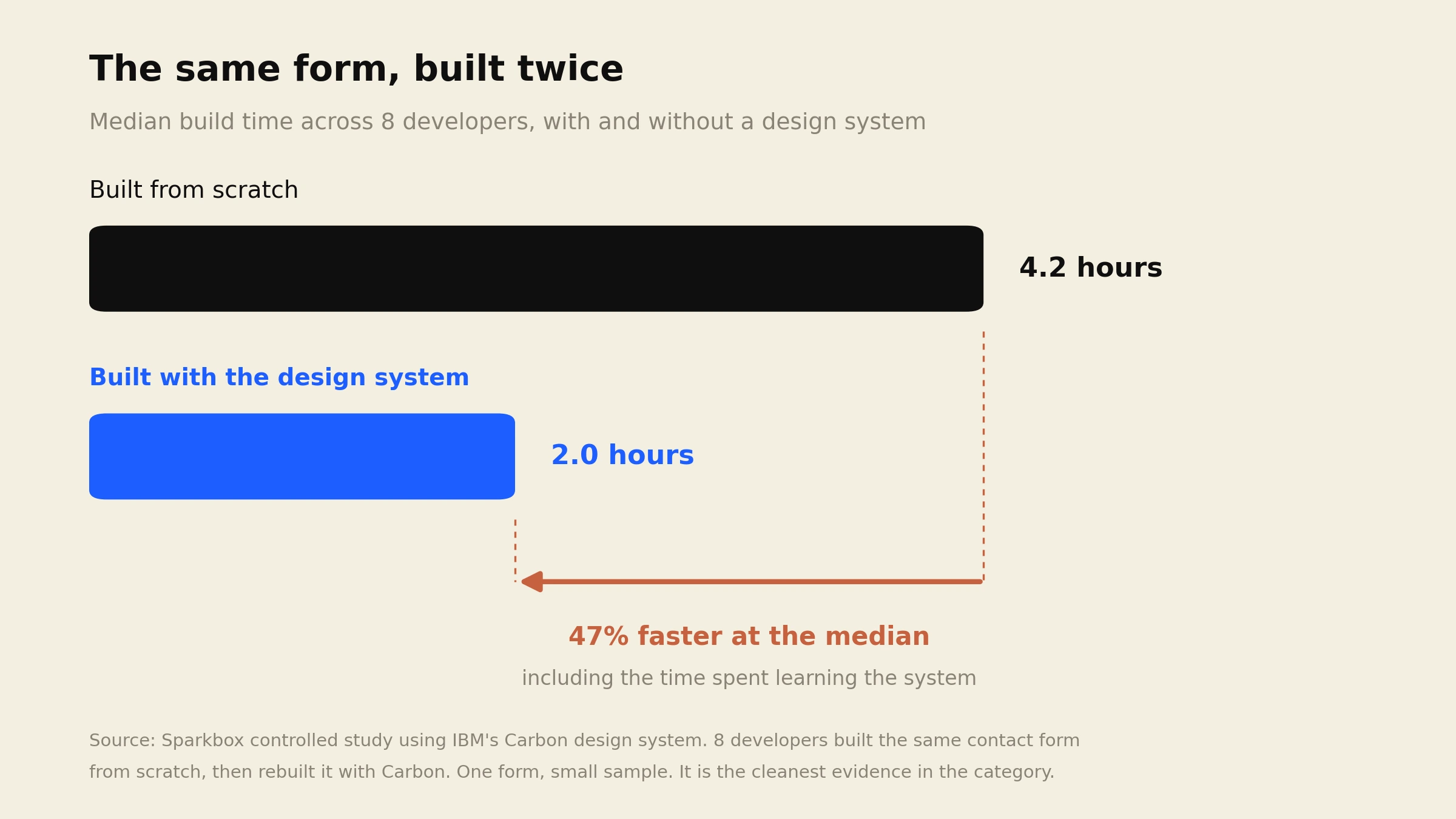
Sparkbox ran a controlled study using IBM’s Carbon design system. Eight developers built the same contact form from scratch, then rebuilt it using Carbon. The Carbon version was 47% faster at the median, 2 hours against 4.2 hours, and that figure already includes the time spent learning the system.
One form. Eight developers. It is a small study and it deserves to be described as one. It is also the cleanest evidence in this category, and it points at the real mechanism: the saving is not in the first screen, it is in every screen after it.
That is why the payback question has a shape. A system that covers 12 screens is overhead. The same system across 80 screens and three years of feature work is the cheapest thing your product bought. The number that decides it is not your budget. It is how many screens you are going to ship after the system exists.
The metrics worth tracking afterwards, if you want to prove it internally: component reuse rate, UI defect density per release, and lead time from concept to production. Those are measurable. “Consistency” is not.
Three ways teams waste the money
Building it before there are screens. A design system is an abstraction of decisions you have already made. Build it at 15 screens and you are guessing which patterns repeat. Most teams get better value building it after the product has enough surface area to show its own patterns, usually somewhere past 30 to 40 screens.
Buying 100 components and using 40. The Enterprise tier exists because some organisations really do need multi-brand theming and governance. Most do not. Paying for 100 components when your product has 45 distinct UI patterns is paying for a catalogue.
Shipping it with no owner. This is the expensive one. A design system with no maintainer drifts within two quarters. Engineers hit a case the library does not cover, build a one-off, and the one-off becomes the fourth button variant. Twelve months later you have a design system and an inconsistent product, which is the worst of both purchases. If nobody owns it after handover, buy a smaller system.
Build, buy, or accrue it
Three routes, honestly described.
Build it as a project. Correct when you have a hard deadline, a platform team ready to receive it, and the governance to keep it alive. Costs what the price list above says. Takes 12 to 20 weeks at the top tier.
Start from an open source base. Carbon, Material, Radix and similar give you tokens and primitives for free, and you pay only to make them yours. This cuts the bill by a lot, and the trade-off is that your product inherits a visual language many other products share. For internal tools that is fine. For a product you demo competitively, it is a real cost in a different currency.
Accrue it.Design the screens you actually need, and extract the system out of them as patterns repeat. Slower to reach “done”, but you never pay for a component nobody uses, and every component ships having survived a real screen.
That third route is the one a subscription is shaped for. DesignShare is a senior designer, a web designer and a project manager for $3,495 a month, one active request at a time, roughly 48 hours per request. Dashboards, admin panels, data tables and onboarding flows are most of what we do, and the component library grows as a by-product of shipping them.
The arithmetic: four months is $13,980, which sits under the bottom of the Enterprise range and inside the Growth range, and over those four months you are also getting the screens themselves rather than only the library. Against a $38,000 project quote, that is a different purchase at roughly a third of the price.
The trade-off, stated plainly, because it matters here more than on other work. A subscription will not hand you Storybook documentation, a formal governance framework and a training programme for a 200 person organisation. If you need that, the Enterprise project tier is the right buy and we will say so. What a subscription gives you is a system that exists because screens needed it, maintained by the same team that keeps shipping the screens.
If the screens are the actual problem, the cost side of that is broken down in the SaaS dashboard design cost guide and what an onboarding redesign costs.
Cheapest way to find out which route you need: the $499 UX audit. Up to 10 product screens, 20+ annotated findings, a prioritised fix list, 5 business days. If your screens turn out to share 12 patterns wearing 30 different styles, that is a design system problem and the audit will show it on the page. Full $499 credits toward month one if you subscribe within 30 days.
Frequently asked questions
Want a senior team building your product screens, and the system underneath them, for a flat $3,495 a month? See the full scope and pricing.