A founder emailed last month asking what an onboarding redesign should cost. Fair question. It was also the second question, asked first.
The first question is what one point of trial-to-paid conversion is worth to you. Until that number exists, every quote looks either expensive or suspiciously cheap, and there is no way to tell which. We sell this work, so treat the pricing here as informed rather than neutral. The benchmark numbers underneath it are public and checkable.
Start with what a point is worth
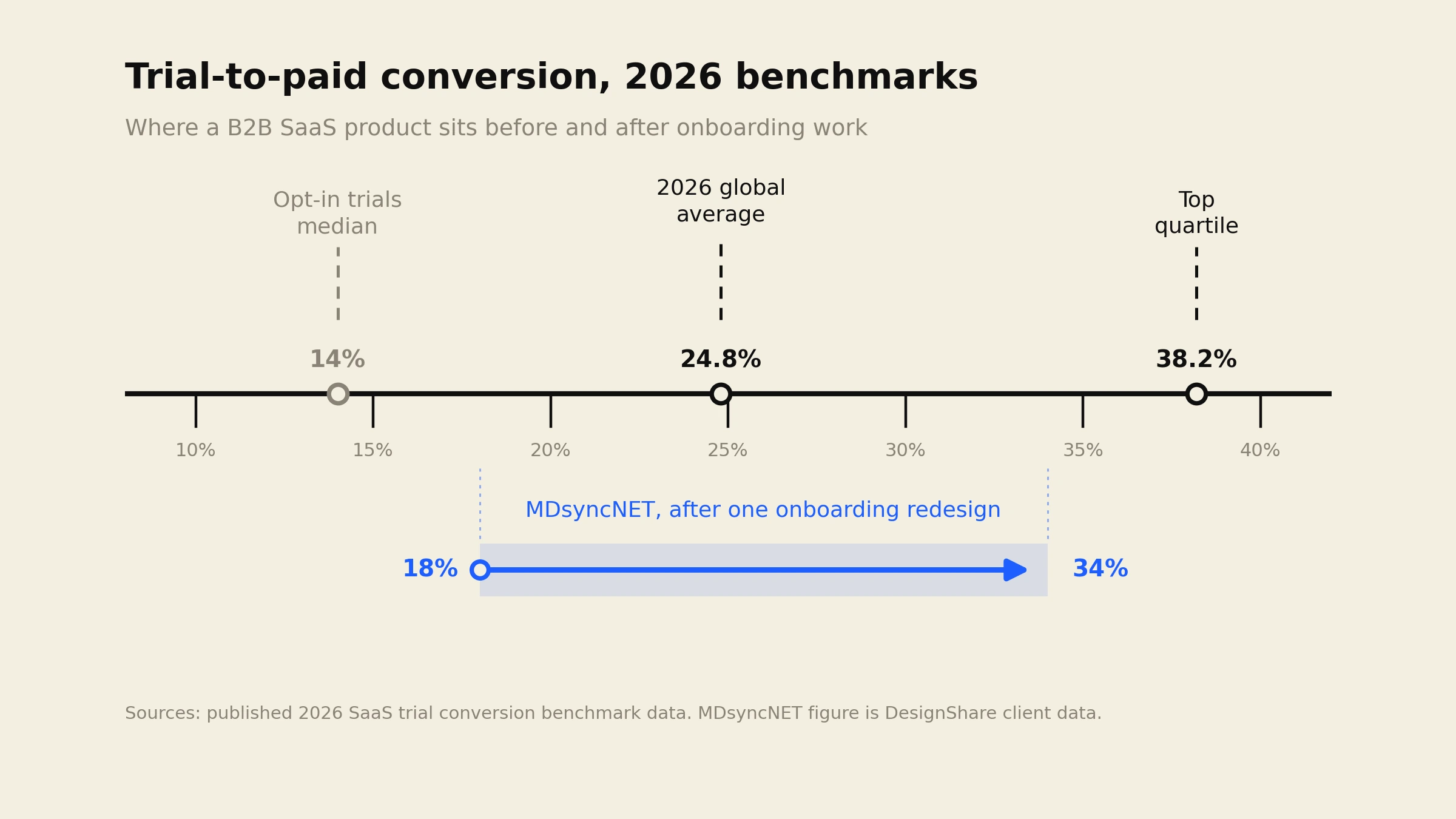
Published 2026 benchmark data puts the global average trial-to-paid conversion rate at 24.8%, with top-quartile products landing around 38.2%. Split by trial type the picture sharpens: opt-in trials with no credit card convert at a median of about 14%, while opt-out trials that take a card up front sit near 44%.
So the headroom between an average product and a good one is roughly 13 points. That is the prize. Now price it.
Take 400 trials a month converting at 20%. That is 80 new customers. Move the same traffic to 28% and it is 112. Thirty-two additional customers, every month, from traffic you already pay for. At $150 a month each, that is $4,800 in new monthly recurring revenue, and the next month it happens again.
Against that, a $15,000 redesign pays back in about three months and then stops costing anything. A $60,000 redesign pays back in a year. Both can be correct. Which one is correct for you depends entirely on the arithmetic above, which is why you run it before anyone quotes you anything.
The 2026 price list
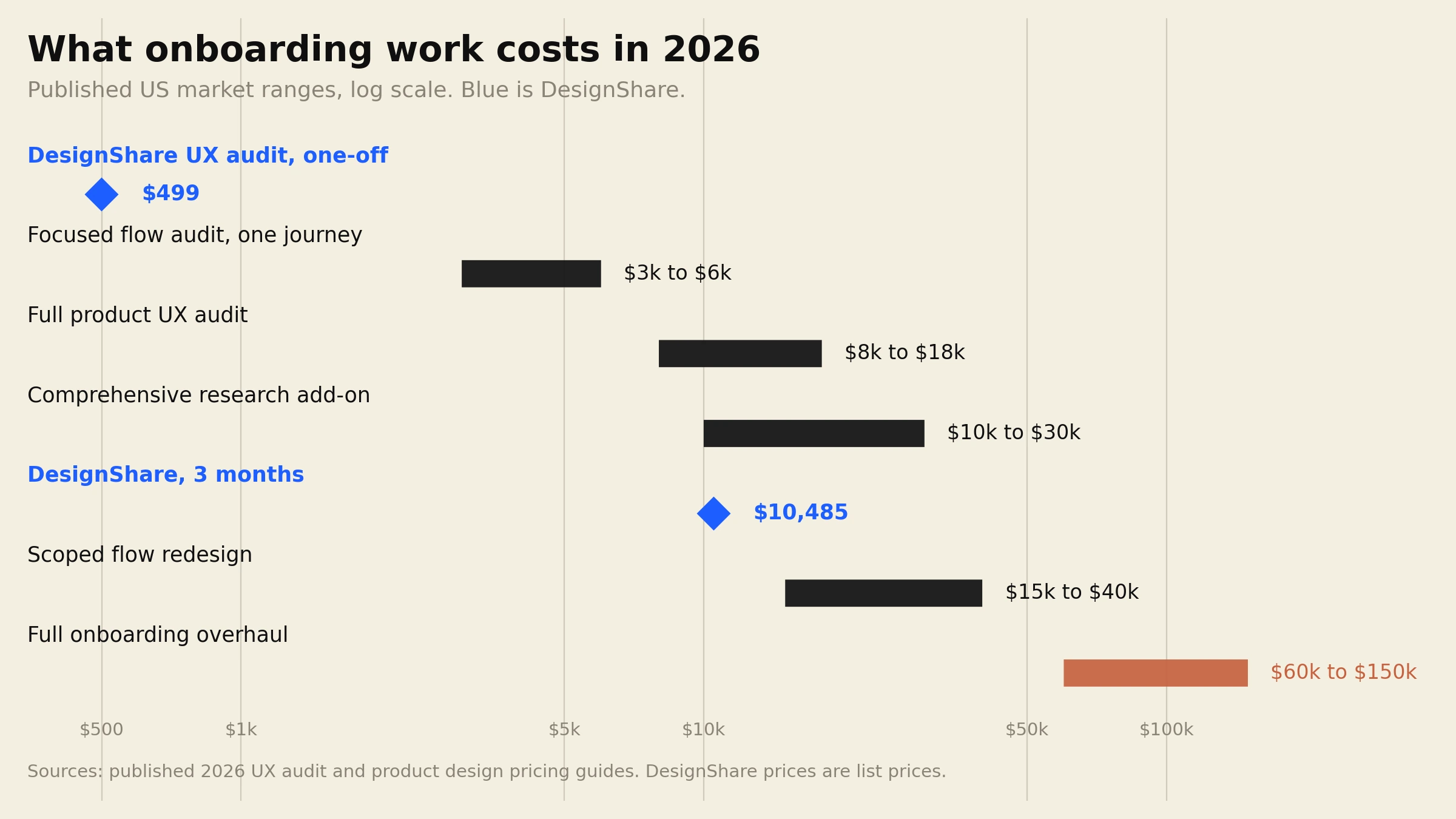
Here is what the market actually charges this year, from published 2026 UX pricing guides rather than from anyone’s sales page.
Onboarding UX audit, one flow. $3,000 to $6,000. A heuristic review of a single journey, a findings document, a prioritised list. No new design.
Full product UX audit. $8,000 to $18,000. Heuristic review plus session analysis plus some real user testing, across the product rather than one flow.
Enterprise audit. $18,000 to $25,000 and up. Regulated products and multi-role platforms push past $30,000, and the ceiling reported for heavily regulated work is around $75,000.
Research phase, if you add one. Light research covering user interviews and competitive analysis runs $3,000 to $10,000. Comprehensive research with usability testing and funnel analysis runs $10,000 to $30,000.
The redesign itself. This is where the range gets silly, and fairly so: $5,000 at the audit-only end to more than $150,000 for a full overhaul of a complex multi-role product.
Hourly rates behind those numbers: $100 to $149 at mid-market specialists, $150 to $200 at senior boutiques, $200 to $300 at highly specialised firms.
One line from the pricing guides deserves its own paragraph, because it is the one nobody volunteers on a sales call. Agencies add project management, QA and business overhead on top of the design rate, typically 40% to 60%. When a $150 hourly rate turns into a $40,000 quote for six weeks of work, that gap is where it went. It is not dishonest. It is just invisible unless you ask.
What actually moves the number
The biggest cost driver in an onboarding project is not the number of screens. It is the number of user roles.
An admin, a team member and a read-only viewer do not share an onboarding flow. They share a name. Each role has its own first-run state, its own empty states, its own permission walls and its own idea of what “set up” means. Three roles is not 1.3 times the work of one role. It is closer to three times, and most quotes that come in low have quietly scoped one.
The second driver is whether live user testing is in scope. Watching eight real users fail at your signup is the single most useful thing you can buy, and it is also what separates an $8,000 audit from a $3,000 one.
Third, and this is the one we argue about most with new clients: empty states. A new user sees your product at its worst moment, with no data in it. Zero projects, zero teammates, zero history. That screen is the actual product for the first ten minutes, and in most B2B SaaS it was never designed at all. If a vendor’s onboarding proposal does not mention empty states, they have scoped the happy path and you will pay for the rest later. We wrote about how these states drive cost across product screens generally in the SaaS dashboard design cost breakdown.
The mistake that wastes the whole budget
Spending $30,000 on a redesign without instrumenting the funnel first.
This happens constantly. The flow gets rebuilt, it looks enormously better, everyone agrees it feels better, and three months later nobody can say whether conversion moved, because there was no clean baseline and no per-step drop-off data before the work started.
You need four things captured before the first Figma file opens: signup starts, signup completions, activation events (whatever “first real use” means in your product), and the conversion to paid. Per step, per role, for at least four weeks. If that data does not exist, the cheapest useful thing you can buy this quarter is a month of clean tracking. The redesign can wait four weeks.
The second version of this mistake is redesigning onboarding when the problem is upstream. If 70% of trial users never reach the second screen, the issue may be the traffic, the promise on the pricing page, or a signup form asking for a company size before it has earned anything. Fixing a flow that people never enter is expensive theatre.
How to scope it, in three honest sizes
You have a hypothesis and no budget. Buy an audit, not a redesign. A focused flow audit at $3,000 to $6,000 will tell you where the drop-off is. Our version of this is the $499 UX audit: up to 10 product screens, 20+ annotated findings, a prioritised fix list and a 15 minute walkthrough, delivered in 5 business days. We price it as an entry point rather than a profit centre, and the full $499 credits toward month one if you subscribe within 30 days.
You know the problem and need it fixed. This is a scoped redesign: the signup flow, the empty states, the first-run experience for each role, and the activation moment. At agency rates that is commonly $15,000 to $40,000 depending on roles and research. On a subscription it is a sequence of requests rather than a project.
The product has outgrown its first-run experience entirely. Multiple roles, permission tiers, an admin surface, an onboarding flow that has been patched for three years. That is a $60,000 to $150,000 project at an agency, and it is the one case where a big agency engagement with formal research is clearly the right purchase.
Where a subscription fits
DesignShare is a senior designer, a web designer and a project manager for $3,495 a month, one active request at a time, roughly 48 hours per request, pause or cancel whenever. Onboarding flows, dashboards, admin panels and data tables are most of what we do.
The arithmetic against the middle tier: three months is $10,485, which sits below a single scoped agency redesign and delivers something closer to 45 requests instead of one project. The onboarding flow, the empty states, the role variants and the settings screens nobody scoped all move through the same queue.
The trade-off is real and worth stating. One active request at a time means a 40-screen overhaul arrives in daily slices rather than in one parallel sprint. If you need four designers in parallel for a quarter with formal user research attached, buy the agency project. That is what it is good at.
One data point instead of adjectives. MDsyncNET had their onboarding redesigned on this model and trial-to-paid went from 18% to 34% in two weeks. Against the 2026 benchmarks above, that is a product moving from well below the 24.8% average to within touching distance of the 38.2% top quartile. One flow, two weeks.
If you want the patterns rather than the pricing, the 5 onboarding patterns that actually convert covers what we change and why.
Frequently asked questions
Want a senior team on your onboarding flow for a flat $3,495 a month? See the full scope and pricing.